Patient Insight:
Longitudinal View of Patient History

Patient Insight: A clinical decision making support tool: Myositis Center of Excellence instance
Patient Insight
Role: Design Lead: UI & UX
Collaborated with: Project managers, product leads, software engineers, stakeholders, other designers, clinicians, data scientists, and patients
My Contribution: Conducting user interview, insight gathering and analysis, creating wireframes and prototypes, testing, maintaining overall user experience
Research Methods: User interviews, usability testing, a/b testing, surveys, co-design sessions
Duration: 2020 - Present
Read more about this Project on TIC’s Website.
The Problem
It’s challenging for clinicians at the Johns Hopkins Hospital to remember all the details from their patients’ medical histories. In average each clinician spend between 20 -30 minutes to prepare for each patient before a clinic visit. They have to go to epic and use different tabs in epic to look for MRIs, lab results, etc. They need to click through each lab result, or scan and read through each event and take notes to remember the details of each result.
The Solution
Patient Insight is a clinical decision support tool that visualizes patient health record longitudinally on a dashboard and helps clinicians to better understand patient’s health progress over time. The views are curated by each disease center based on their needs.
UX Research
When I took over this project, the first version of the app was built by a team of developers. The app had some accessibility issues, missing many important features and there was a need to learn more about users’ needs and pain points.

This is how the Patient Insight app looked like when I took over the project. (first version). The yellow and green frame is Epic interface and the gray & blue interface is Patient Insight which is accessible within Epic.
Note: I have intentionally covered all Epic information even though this profile is not a real patient and is only used for demo purposes.
We started our research by conducting interviews with clinicians who were using the application (+ 10 interviews for the start). I talked to multiple clinicians from various disease centers (initially Multiple Sclerosis, Scleroderma, and Myositis) we learned that there was a need to redesign the layout to better use the real estate and improve UX of some smaller features such as filtering, categorizing charts, etc. They mentioned that they have to click through many things to get to the information they were looking for.
“Filters are very important for us, the process should be easier and faster, so I can toggle on and off quickly.”
“This tool should be a snapshot of all the patient’s information. During visits, I need to quickly look at my screen, do a few clicks and turn to my patient and talk to them.”
I use Dovetail, for documenting and categorizing interview notes in one place. Dovetail helps me better recognize patterns and overlaps between these interviews.

Interview tags on dovetail: A way for categorizing interview notes.
After presenting my findings back to the technical team and the project lead, we did some brainstorming and white boarding multiple ideas. I started sketching a few different layouts for the application. Based on the interviews and talking with the development team I realized there were two top priority issues:
1. Better use of the real estate
2. Redesigning the filtering feature
There were many other areas we covered during the discovery and delivery phase such as making the app more accessible and responsive, adding more details on hover and on click, zooming in/out action, normative ranges, improving the data visualization, and many others. But for the purpose of presentation, I am going to only focus on the first two problems we tackled.
I usually start with drawing on paper and then transfer to design software.
Charts & Real Estate
For solving the real estate issue, we realized we could expand the charts and move the legends to the top of each chart and reduce the unused area between charts and legends.
We also made each chart collapsible to improve the navigation and scannability of the dashboard for scenarios with multiple line graphs.

Before redesign: The legends were on the left and charts are located on the right. The users needed to go back and forth between the legends and charts to read data points. Additionally, the colors were not accessible for visually impaired users.

After Redesign: Improved accessibility, Collapsible charts, redesigned icons, expanded charts and relocated the legends, added a zoom feature, and many other small features.
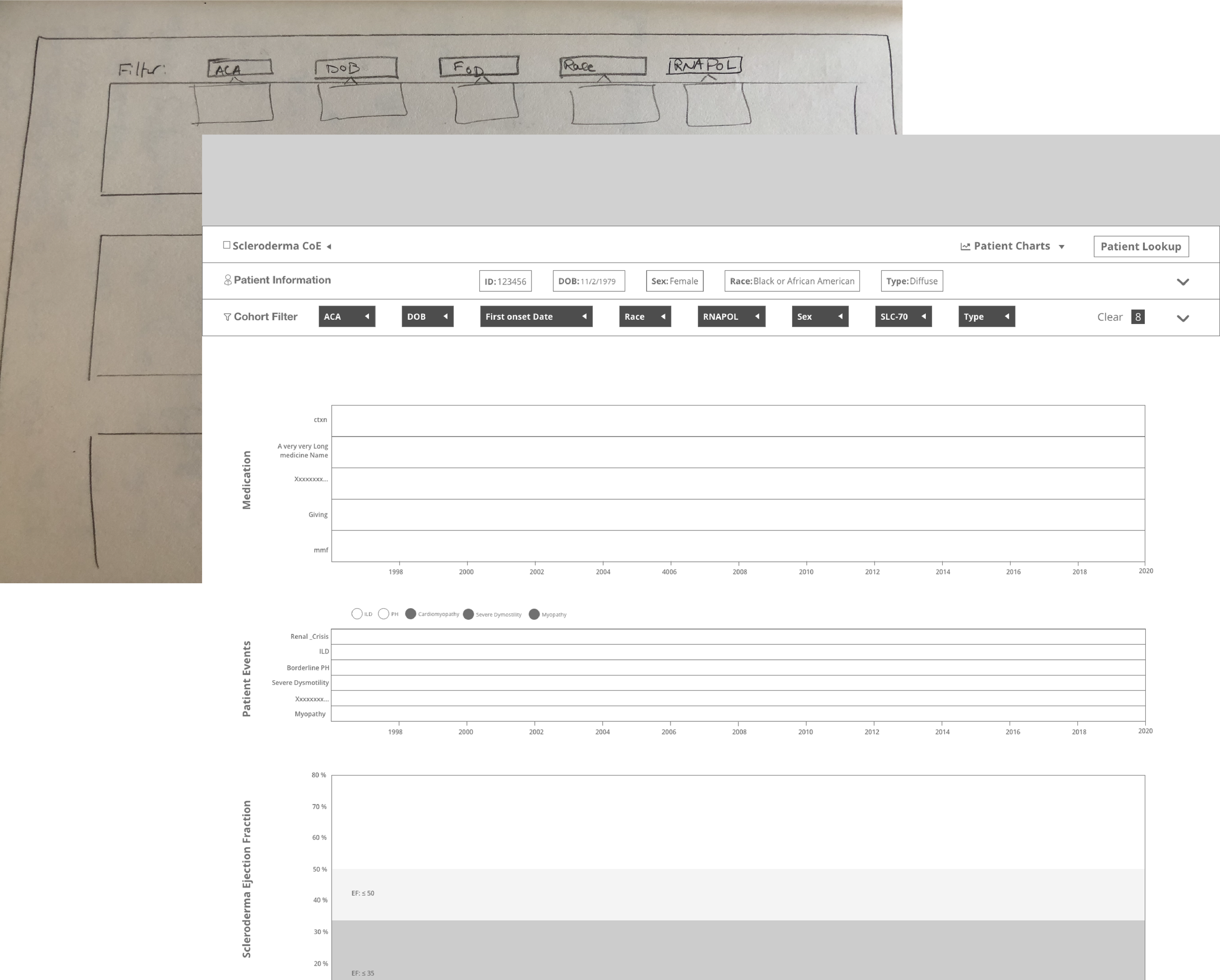
Cohort Filters
Another pain point was the cohort filters. Cohort filters compare the patient’s status with other patients who have same characteristics (age, gender, etc.). The previous design for cohort filters were not very intuitive because users had to go through each filter and apply them individually. The challenge was that there were multiple categories for filters, and clicking each category separately was time consuming and cumbersome for users.
We came up with the idea of adding a button to match the filters based on the patient’s characteristic. So by only one click, users could pre-populate the filters and compare their patients with their cohort.

Match Patient Button, before applying filters.

Filters applied
We test high fidelity wireframes multiple times - before implementation- by various user groups to make sure the solution is sustainable and generalizable for most of our stakeholders from various disease centers.
The Result
Below you can see a screen recording of the Patient Insight app while being used by a user.
The first version of the redesign was built and tested successfully in 2020. But Patient Insight is an ever changing application and I have been working closely with a team of clinicians, data scientists, project managers, and developers to constantly improve the app and add more features to it.
The user group of Patient Insight is constantly growing, and more centers become interested in using this tool. This makes the design process more challenging since our goal is to create an inclusive and generalizable solution that could help Johns Hopkins’ clinicians.
In the past years Patient Insight was upgraded with multiple features such as adding prediction scores and trends, normative ranges, guides and recommendations, letting users create their own views, and so on.
Measuring Success
There are different ways that we measure success of the the features we add to this application.
First and foremost, we have regular check-ins with our user groups from different centers to hear any potential issue or concern.
In the past year there were increased interest from multiple disease centers to collaborate with us and get access to Patient Insight. We now have +10 centers using this dashboard or waiting in the queue to access to this tool.
Researchers are becoming more interested to publish papers and articles using this application.
More…
I worked closely with Scleroderma center at Johns Hopkins Hospital (one of the centers that is currently using Patient Insight for some of their clinic visits) to run a study and evaluate this tool and its impact on both Scleroderma clinicians’ workflow and patients’ understanding of their health status. The result of this study is going to be published soon.
Lessons Learned
It is very challenging to design a generalizable solution that would make everyone happy. Sometimes I had to compromise some features to make sure that the design is inclusive.
I learned that I had to keep interviewing users from different backgrounds. I had to find various ways to make connection with clinicians from different centers and build trust which was a bit time consuming but very rewarding.
Patient Insight’s main target user is clinicians, but sometimes clinicians turns their screens to patients and show them the dashboard. This played a very important role in the information architecture on the dashboard. I had to think about the emotional experience of the patient and how they would react after looking at their disease progress over time and prediction of their progress in the next few years.